Duration:
Aug 2020 - Mar 2022
Role:
UX & UI Designer
Product teams:
CX, Self-service,
Onboarding
Platform:
Desktop & Mobile
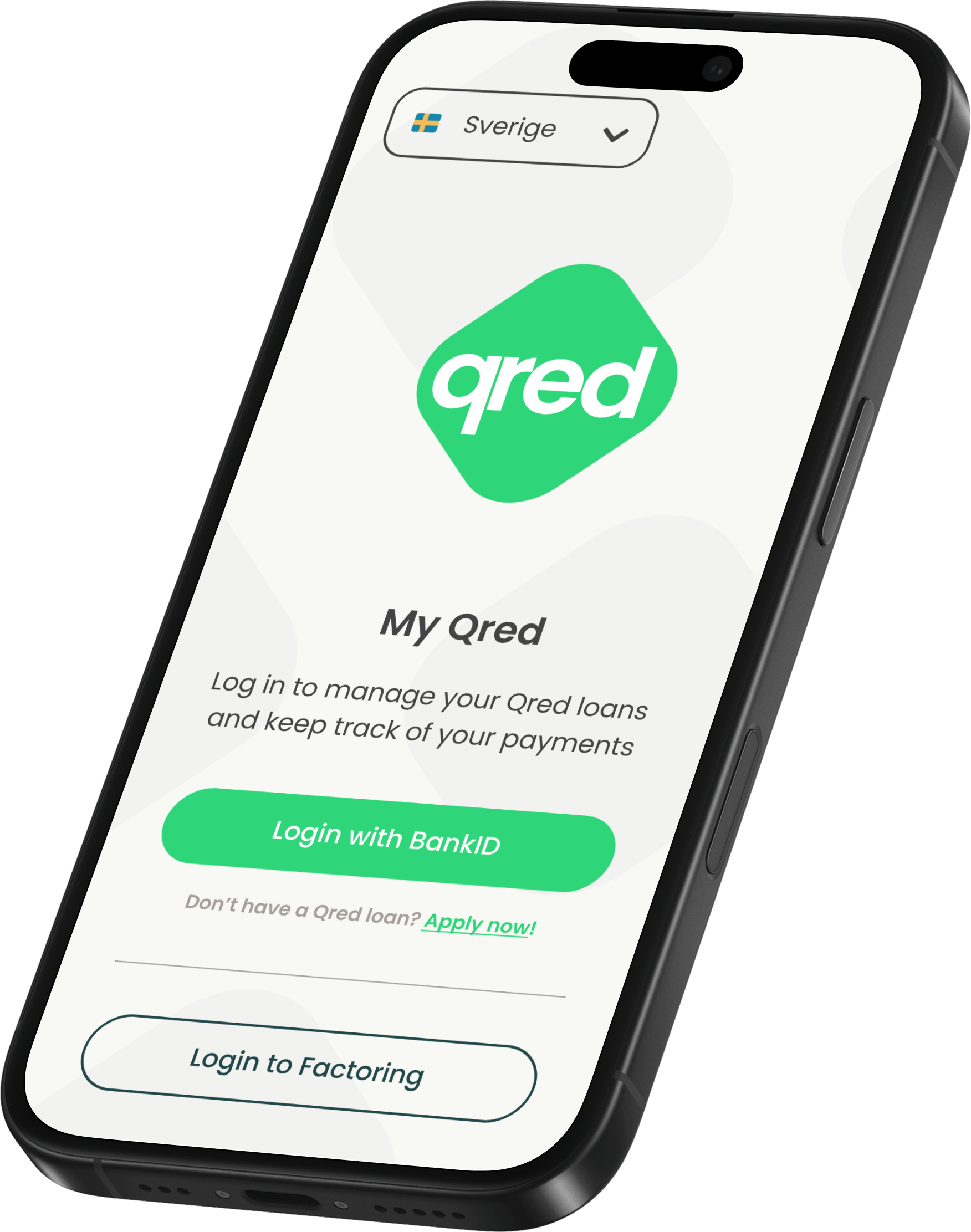
My Qred
My Qred is a self-service platform by Qred AB that allows businesses to manage their loans, track payments, and access financial services. It provides a seamless experience for applying for loans, receiving approvals, and monitoring repayment progress, including gamification elements to enhance user engagement.
Problem
The My Qred platform needed a more seamless and user-centered customer experience (CX) for self-service and onboarding. The existing flow lacked clarity, making it harder for users to navigate key steps—from signing up and applying for a loan to managing repayments. Additionally, Qred lacked detailed user journey insights, making it difficult to identify friction points and optimize conversion rates.
Solution
As a UX Designer, I was responsible for the CX flow on My Qred, focusing on self-service and onboarding improvements. We implemented GA4 funnels and segmentations to analyze user behavior and identify pain points. Based on these insights, we made feature updates to streamline the experience:
✅ Improved onboarding for new users.
✅ Optimized the loan application and approval process for clarity and ease of use.
✅ Introduced gamification elements to encourage loan repayment and track progress.
✅ Used GA4 insights to enable data-driven decision-making and continuous improvements.
Result
The improved self-service and onboarding flow led to a smoother user journey, reduced friction from onboarding to loan approval, increased conversion rates, and enhanced user engagement through gamification.
Holistic CX planning
As a UX-designer at Qred, I worked on making usability-improvements for our self-service platform MyQred as well as our onboarding flow. In parallell, I contributed with creating and maintaining components for Qred’s design system built in Figma.


